|
I'm hoping this comes to an Imax near me soon. My kids can go see Bey and TayTay in the other theaters.
0 Comments
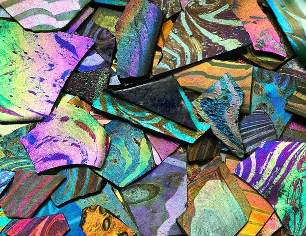 Photo: Picture of shards of Tiffany Favrile glass in the collection of the Queens Museum.
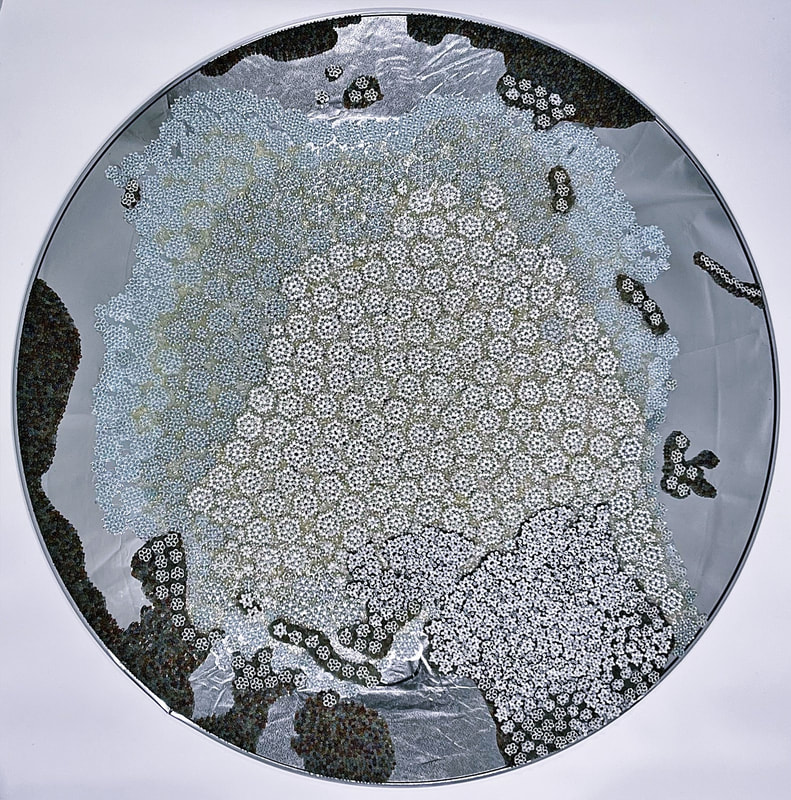
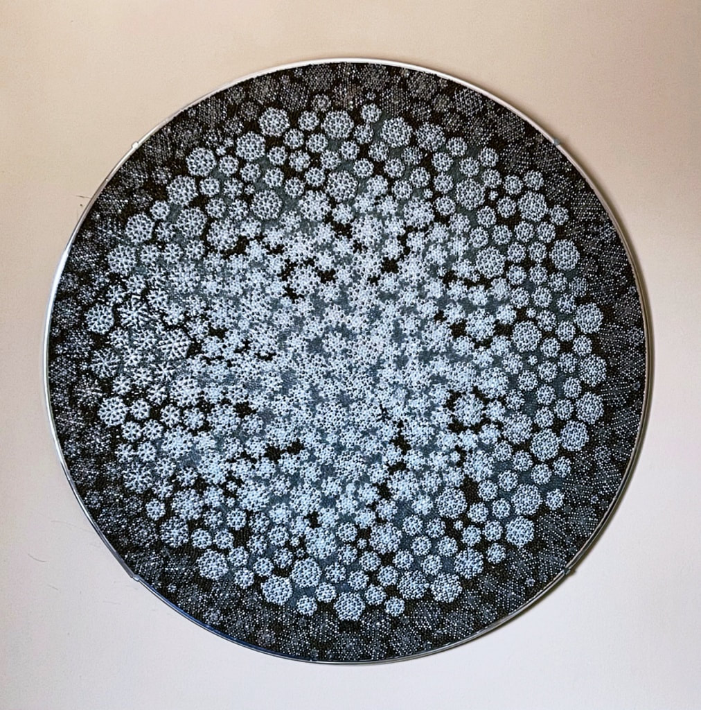
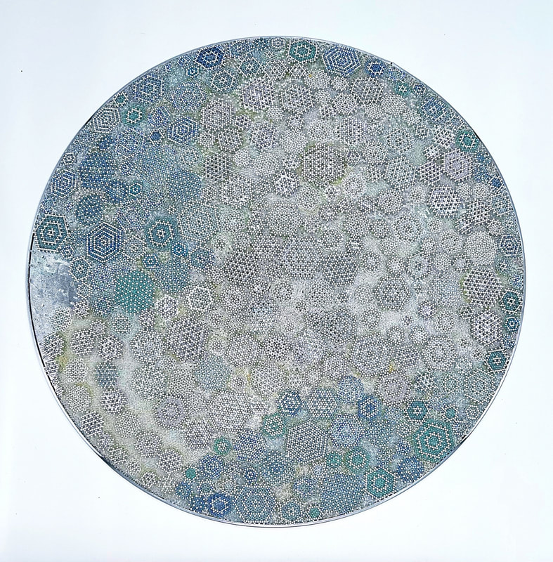
I have been busy fashioning scrap stained glass that I have been collecting from all over into mosaic tiles. Fun Fact! Stained glass artisans often don't bother to use their scrap glass and there are a lot of them out there trying to unload it. I visited a stained glass shop and school that had boxes and boxes and boxes of scrap. After looking through maybe three boxes the proprietor showed me more and also said there were full crates outside. I was dumbfounded. I took two boxes, but should have grabbed more. I'm guessing if you are making stained glass projects according to patterns you don't have time to go in and sort your scrap and reuse it. I started by sorting glass shards into more or less the color palette I will be using. Then I started cutting and shaping the reddish glass into tiles for a maquette. The warm colors in the palette are rosy and pinky and, unfortunately, rarer in stained glass. But I have enough for the maquette. I was unmoved while working with the reds. Ho hum. Good yellows are extremely hard to find. Yellow stained glass runs amber or has an acid green hue mixed in. Neither of those will work for this project. I am mixing some glass paint to approximate the hues I need for the project. I'm painting repurposed clear sheets of glass that I've cut into tiles. If I get the commission there is an expensive glass paint company that will custom mix paint colors for you. I will invest in those then. For the last three days or so, I started processing the blue scraps. Dear Reader, cutting and shaping the many varieties of blue glass I've collected has been an immersive and heady delight. Every time I toss a new tile onto the done pile, it's like gazing into an increasingly deep and enchanted pool. Just gorgeous. I have plans for this glass. Oh! and I'm really excited about this new translucent grout. Normally, I hate grout, but this stuff is The Answer. No, it's not the cheesy glitter grout.  Thanks to Lynne Kornecki of ArtBeat for interviewing me for ArtBeat's Artist Spotlight. Click the logo above to visit the article at ArtBeat. Text of the article follows: Roselle, IL artist, Julie Mars, poses with her work -- "ARCTIC ICE SHEET" -- convex security mirror topped with decorative glass bead mosaic design. Scroll down to see more of Julie's art pieces...
Many of Julie Mars’ art projects begin with a treasure hunt. By exploring thrift stores, garage sales, flea markets and other second-hand sources, Julie finds glass or mirrored items that are just the right shape and size to upscale into a unique piece of shimmering art. Preferring to work with highly reflective surfaces like large, circular convex security mirrors or glass globe vases, she weaves her favorite sized glass beads to create an intricate mosaic to layer on top. She uses off-loom weaving techniques like the peyote stitch, and then glass paint to act as a clear adhesive when affixing it to the substrate. While studying at Chicago’s School of the Art Institute, she focused on 3D and sculptural work. In her 20s, she started experimenting by decorating small jars, but the finished result was too craft-like for her taste. So, she decided to start scaling up in size. “I really like how light passes through the glass bead mosaic pattern on top and then bounces around through my work and out again,” Julie explains. “It makes the finished effect extra luminous. As the light changes throughout the day – so does its reflectivity. They’re so much fun to make.” Julie’s Artist Statement explains more… My love for glass and reflective acrylic beads comes from the diverse colors, lusters, translucencies, and other optical effects they offer. Recently, I have been working on installations and a series of woven bead mosaics on convex mirrors, exploring new possibilities in my chosen medium. …My work is driven by a deep passion for environmentalism and the beauty that can be found in repurposing used items. I strive to create pieces that not only bring aesthetic pleasure through innovative design but also inspire others to reflect on the impact of their choices on the environment. Through my bead mosaics, I hope to spark a dialogue around sustainable art, and to demonstrate that post-consumer materials can be transformed into something truly beautiful. Ultimately, my goal is to promote a more mindful and eco-conscious approach to art and consumption. Julie has over 25 years of experience as an artist, gallerist, and museum administrator. Currently, she works at the Addison Center for the Arts as Communications Director, where she fosters and promotes arts in the western suburbs. She accepts commissions and her weaving techniques can be found on a YouTube tutorial that she created here: https://www.youtube.com/watch?v=3n0ZxzVToLo&t=37s Her work is currently part of the Addison Art Guild’s 2023 Fall Members’ Show, 213 N. Lombard Road, Door 4, Addison, IL on display now through December 9, 2023. Additional pieces are on exhibit at the Epiphany Center for the Arts, Chicago Sculpture International, 201 S. Ashland, Chicago; Art Events - Epiphany Center for the Arts (epiphanychi.com) 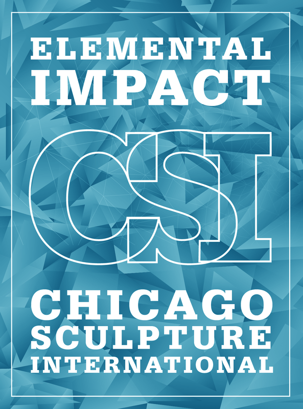 The opening reception for Elemental Impact is Friday, November 17, 2023 from 6 to 9 pm at the Epiphany Art Center's Chase Gallery. This is a group showing of Chicago Sculpture International and will feature the work of 34 sculptors. The exhibit was curated by K. R. Fowler. For more information follow this link to RSVP and get more information. I will be showing "Arctic Ice Sheet" from the Floe Series.   The Zero Landfill Crew The outlets below are good sources of art making or crafting materials in or around Chicago. Some of these organizations offer educators deep discounts or free educational materials for their classes. I will try to update this when new organizations start up and others close.
1. The WasteShed - "The Wasteshed is a nonprofit with creative reuse centers in Chicago and Evanston. We collect reusable art and school materials that would otherwise be thrown away... and make them available to teachers, artists, and anyone who needs them, at low or no cost. 2. Chicago Creative ReUse Exchange - At the Creative Chicago Reuse Exchange (CCRx) we believe that "trash is just a failure of imagination." "We are a 501c3 nonprofit that redistributes donated surplus materials, equipment, and supplies. We keep good things out of the landfill and get them into the hands of people who can use them. We focus on Chicago teachers and their students, non-profit organizations, and arts and community groups, but we're open to everyone. We promote creativity, a circular economy, and environmental stewardship through creative reuse programming, products, and partnerships. Our goal is to educate and empower people to reduce waste, reimagine surplus and make creative reuse a fundamental part of our collective infrastructure."Location and Hours Warehouse Envision Unlimited Frick Center 2124 W. 82nd Place Chicago, IL 60620 Open by Appointment Wednesdays + Thursdays 10am - 5pm Saturday 10am - 4pm 3. SCARCE - "We help people discover how easy it can be to make a meaningful difference for our kids, for our environment, for our future…and often for all three at once." 4. Zero Landfill Chicago - "ZeroLandfill™ is an award winning upcycling program held seasonally that supports the supply needs of local artists and arts educators while reducing pressure on local landfill capacity. Since 2008, the ZeroLandfill™ Chicago team has partnered with the architectural and interior design community in identifying, diverting from local landfills and re-purposing back into the community over 500,000 pounds of expired specification samples that hold value for other audiences. Contact info@zlfchicago.net for more information." 5. ReUse Depot - "To keep reusable building materials from entering the landfill. We are able to do this by promoting environmentally friendly deconstruction over traditional demolition, thereby saving the embodied energy that went into the making of the original building materials. These materials are then harvested from our deconstruction sites, brought to our warehouse, and offered for sale to the general public at a fraction of their original cost. Together, Reuse Depot Inc. and Blue Earth Deconstruction work to provide you a tax-deductible donation method for any size donation of reusable building materials that we are able to accept. No donation is too large or too small for us to consider. From a kitchen or bathroom sink that is no longer needed to a full house deconstruction, we have the means and methods to assist you through your donation." 6. All American Reclaim - Reclaimed wood and salvaged material. 7. American Science and Surplus - This outlet is a mix of surplus and retail. 8. Ebay, Facebook MarketPlace. Warning! These can be good places to find what you need, however, some entrepreneurially-minded folks are grabbing listing photos from some of the sites above and posting the items at a high markup on these online marketplaces. Proceed with caution. 9. Thrift Stores. 10. Garage/rummage sales. 11. Flea Markets This is the bead pattern ChatGPT gave me for an ice crystal. I am looking up diagrams of Ice I-h. ChatGPT neglected to inform me that I need to aim for tetrahedral bonding angles at 60-degrees. I think I will also need some short bugle beads- two per "oxygen". Hydrogens should be size 8 or smaller and oxygen-size 6 seed beads or a miracle bead.
Materials: - Clear beads (for hydrogen) ((size 8 seed beads)) - White beads (for oxygen) ((4mm white Miracle beads)) ((-short clear bugle beads)) - Beading thread Instructions: 1. Thread a needle with a long piece of beading thread and tie a knot at one end. 2. String one white bead onto the thread and slide it down to the knot. This will be the center bead of your ice crystal. 3. String three clear beads onto the thread and pass the needle through the white bead to create a triangle of beads. 4. String two clear beads onto the thread and pass the needle through the next clear bead in the triangle. 5. String one white bead and two clear beads onto the thread and pass the needle through the next clear bead in the triangle. 6. Repeat step 5 two more times to complete the first layer of the ice crystal. You should have a hexagon shape formed by the white beads. 7. To create the second layer, string one clear bead and two white beads onto the thread and pass the needle through the next clear bead in the first layer. 8. Repeat step 7 until you have completed the second layer. You should have a hexagon shape formed by the white beads, with a clear bead in the center of each white bead. 9. To create the third layer, repeat steps 3-8, alternating between clear and white beads in each layer. 10. Continue adding layers until your ice crystal is the desired size and shape. 11. Once you have completed the desired number of layers, tie off the thread and trim the excess. 12. Your beaded ice crystal, with its hexagonal crystal structure made of oxygen and hydrogen atoms, is complete! Note: You can adjust the size and shape of the ice crystal by using different sizes of beads, and by varying the number of layers. (I asked it to provide me with a diagram in clear and white beads): Layer 1: Layer 2: Layer 3: W C W C W C C W C C W C C C C C W W C C C C C C W C C W C C W C W C W The Evanston Biennial is up and open. Go see it! There are so many great pieces each by an outstanding artist. I saw artists that I've worked and exhibited with for decades and met wonderful up-and-coming talent.
The EAC space is great for showing art, but the acoustics made it very difficult for conversation. I wanted to talk to everyone, so I was losing my voice by the time we left. The Art Institute of Chicago has .pdf's of most of the catalogues from the Chicago & Vicinity shows that started in 1897. These were prestigious exhibitions for local artists. The museum stopped doing them in 1985, but they still have a glorious reputation among the local artists. Evanston Art Center hosts a biennial now that refers back to these shows. I have a piece in the current one.
I'm a nerd and I downloaded every catalogue they had from here: https://www.artic.edu/search/exhibitions?q=Chicago%20and%20Vicinity This is a trove of Chicago history and art history. On a more personal level, the last show in 1985 featured artists that I have met, are famous, or that taught me in art school. Michiko Itatani, Martyl, Eleanor Spiess-Ferris, Lee Grantham are standouts. Itatani, Spiess-Ferris, and Grantham are still active today. Some of the organizers and trustees of the earliest shows have names like Palmer, Potter, Burnham, Ryerson, Field and Wicker. The name, "Marshall Field," was continuous through the years. In year two, I saw Laredo Taft and Ivan Albright's father, A. E. One of the coolest trivia from the second catalogue is that the artists' addresses were listed! One lady had a studio in the tower of the Auditorium Theater! So. Jealous. Next, I'm going to dip into a postwar show during one of the golden ages of the arts in Chicago. Mies van der Rohe was developing the International Style in Chicago. Maholy Nagy immigrated with his designs influenced by the Bauhaus...1952... The catalogue doesn't have that many images. Vera Berdich is the only person I can recall hearing about. Now, I'm going to jump ahead a generation to 1971 and see who's showing. Oh my god! "Sam Gilliam, Artist" is listed as one of the jurors! Wow. Roger Brown, William Conger, and lots of interesting sculptors with Rauschenberg-type assemblages and a pop minimalist. Neato. Next, let's go back to the WWII era and see what's happening. 1944...Ha! The cover features a painting of happy servicemen returning to their friends and family at a port or something. Wait. There is one lady isolated in the middle of the painting holding two small children she looks very unhappy. Featured artists include Gertrude Abercrombie! Ivan Albright! Martyl. Oh, shit! Joan Mitchell showed a piece called Accordian Player. If that is The Joan Mitchell she was only 19 years old. Louise Dunn Yochim was in this show. She was one of the grand dames of Chicago art. I have one of her books. A very good year. I'll continue exploring these catalogues in my off time and learning more about Chicago art and artists. I am very grateful to the curators for the opportunity to exhibit with so many artists that I've admired for years and to get to know the work of artists that are new to me. I saw their excellent exhibit space prior to installation when I dropped off Arctic Ice Sheet this morning. I am really excited to see the show! Come check it out. If you are planning to attend the opening, RSVP at the link below.
On view: August 26 – October 1, 2023 Opening Reception Sunday, August 27, 1-4 pm RSVP Our Biennial is one of the Midwest’s largest and most prestigious juried exhibitions, offering artists an opportunity to have their work viewed by three talented curators: Chantal Healey, Executive Director, Chicago Public Art Group Denny Mwaura, Assistant Director, Gallery 400, UIC Erica Warren, PhD, Art Historian, Curator, Editor, Craft Quarterly The following artists were selected by the jurors to exhibit their work in EAC’s Biennial: Alice Rebechini, Ann Blaas, Audrey Barcio, Beth Herman Adler, Brian Petrone, Carolyn Cronin Hughes, CoCo Ree, Delaina Doshi, Emma Rose Gudewicz, Erika Mulvenna, Gretchen Jankowski, Indira Johnson, Italav Langmar, Jacqueline Kott-Wolle, Jeanne Reilly, Jennifer Bock Nelson, Jerry Bleem, Jihyun Ra, Juliann Wang, Julie Mars, June Ahleman, Karen Perl, Katheran Lampert, Kevin Lyle, Kim Laurel, Liang He, Lorraine Peltz, Malika Jackson, Marco Bendin, Mariko Ventura, Mary Fedorowski, Mia Capodilupo, Michael Gallagher, Nelson Armour, Nikki Anderson, Peter Mudd, Ramin Takloo-Bighash, Raul Ortiz, Riva Lehrer, Robert Frankel, Robert Tanner, Ruth Lantz, Ruth Poor, Sarah Kaiser , Shelley Brucar, Steven Turner, Susan Bennett, Susan Marx, Tim Lowly, Vanessa Filley, Vivian Visser, William Weidner, Yiwei Wang, and Yvette Kaiser Smith. GALLERY HOURS & VISITOR INFORMATION This exhibition will be held in the First Floor Gallery of the Evanston Art Center (EAC). Masks are optional but strongly recommended for students, visitors and staff. Gallery Hours Monday–Thursday: 9am–6pm Friday: 9am–5pm Saturday–Sunday: 9am–4pm HOW TO PURCHASE ARTWORK Artwork sale proceeds benefit both the artist and the Evanston Art Center. If you are interested in purchasing artwork on display, please contact Emma Rose Gudewicz, Director of Development and Exhibition Manager, at egudewicz@evanstonartcenter.org or (847) 475-5300 x 102. Elemental ImpactChicago Sculpture International Juried Exhibition at the Epiphany Center for the Arts
November 17, 2023 to January 13, 2024Entry deadline: September 9, 2023 Sculptors are invited to enter up to three works in the Chicago Sculpture International Juried Exhibition at the Epiphany Center for Arts Chicago, IL. Call for sculpture submissions for Elemental Impact at Epiphany Center for the Arts in Chicago. This exhibition takes interest in the parts that make up the whole, and how a single element can impact the world at large. Much like a single choice in material or form can change an entire piece, each work in a collective can change and impact the whole by proximity. The works chosen for this exhibition will have a strong sense of material choice and presence that is both able to stand on its own while also engaging with its environment and the works around it in a way that fundamentally changes the experience of the space. The exhibit is being curated by Kaylee Fowler. If selected for the exhibition, artists must be a current CSI member or sign-up for membership. www.chicagosculpture.org/become-a-member An artist statement will be required for the accepted piece. About the gallery: Epiphany Center for the Arts 201 S. Ashland Ave. Chicago, IL 60607 (312) 421-4600 Entry Requirements All entries will be submitted as digital images; jpeg for still sculpture, MP4 for kinetic works. Applications must include a sculpture information in the following form: .docx version | PDF version Contact information: artist’s name, email, website, and cell Example: FirstNameLastName_SublimeSculpture_3 materials, H x W x D inches and year completed. Please also include value of the piece for insurance purposes. Each entry must be saved as a jpeg with the file name in the following format: Artist’s name, title of work, and number of the entry, separated by underscore. Example: FirstNameLastName_SublimeSculpture_3 Please format jpegs to 300 dpi at 4”x 5” or 72 dpi at 1024 pixels in longest dimension. Limit length of MP4 files to 60 seconds max. Place application form along with images into a .zip compressed folder and email to: info@chicagosculpture.org Works must be under 7 feet tall to fit into the space. Any works over 60 pounds the artist must provide assistance/arrangements for moving works in and out of the space. Works can be suspended from the ceiling if under 40 pounds and provided that the hanging specifications are included in the proposal, so that the install team can advise if there needs to be any changes to the layout of the works. If the artist would like the work to be listed for sale for the duration of the exhibition, please include a retail price; Epiphany will take a 30% off of this price for any sales. Calendar Exhibition dates: November 17, 2023 to January 13, 2024 Opening Reception: Friday, November, 17th, 2023, 6-9pm Entry deadline: September 9, 2023, by 6 pm Email notification of acceptance: October 15, 2023 Delivery of Accepted Work: Saturday, November 11, 2023, 12-5pm and Tuesday, November 14, 2023, 12-5pm Pick-up of work: January 16 - 18, 11AM - 3PM Shipping address: Artists who choose to ship their work are responsible for shipping costs to and from the gallery on the given dates. Email kayleefowler7@gmail.com to coordinate shipping information and arrangements. Additional arrangements can be made for drop-off and pick-up. Contact the gallery at: kayleefowler7@gmail.com For general information about the exhibit: info@chicagosculpture.org |
artist
Julie Mars' current events, projects, & inspirations. Archives
November 2023
Categories
All
|
 RSS Feed