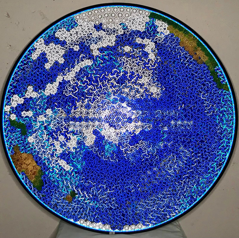
 Gary Schirmer art professor of College of DuPage, NIU and Aurora U awarded Oceanic Panopticon the Best in Show ribbon at Addison Artist Guild's 2022 Spring Members' Show today. I am grateful and honored for the recognition.
In other news, Enchanted Spring was accepted into the CAVA art show in Beverly that opens in a couple of weeks. Blackfoot glacier was accepted into Sculpture at the Kavanagh.
0 Comments
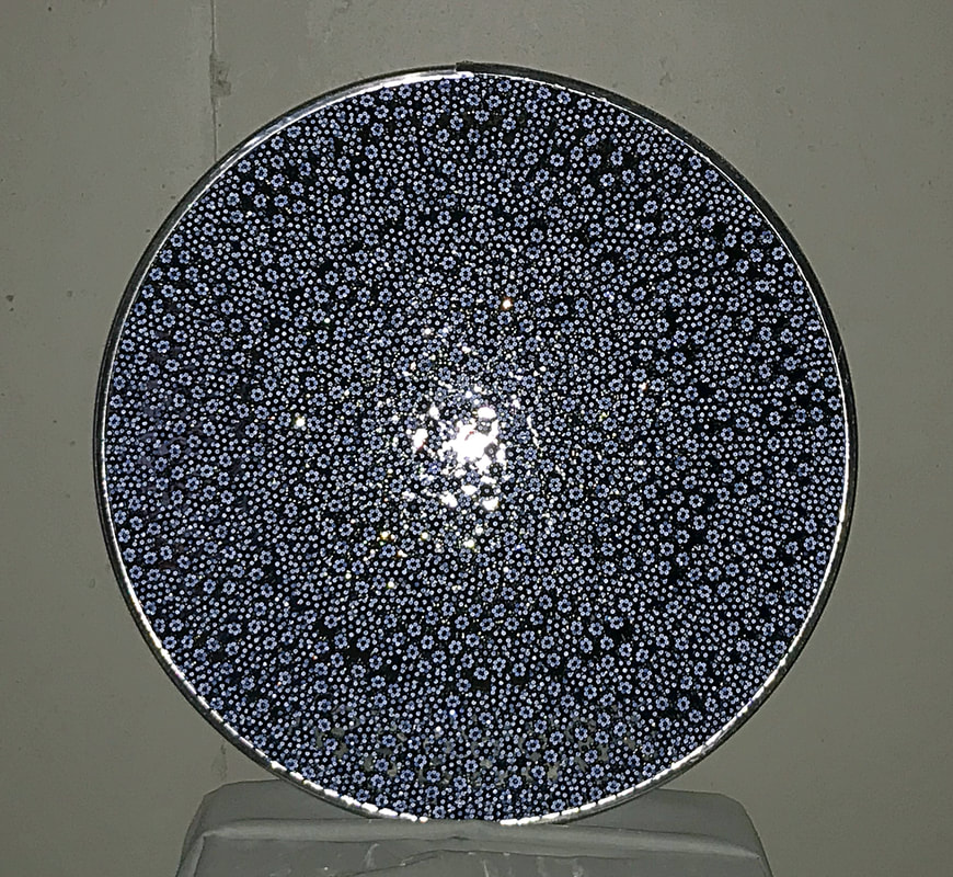
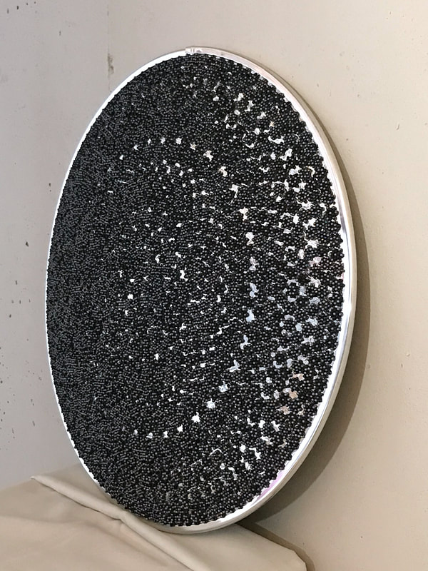
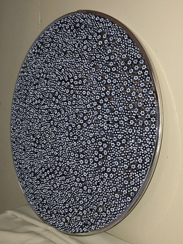
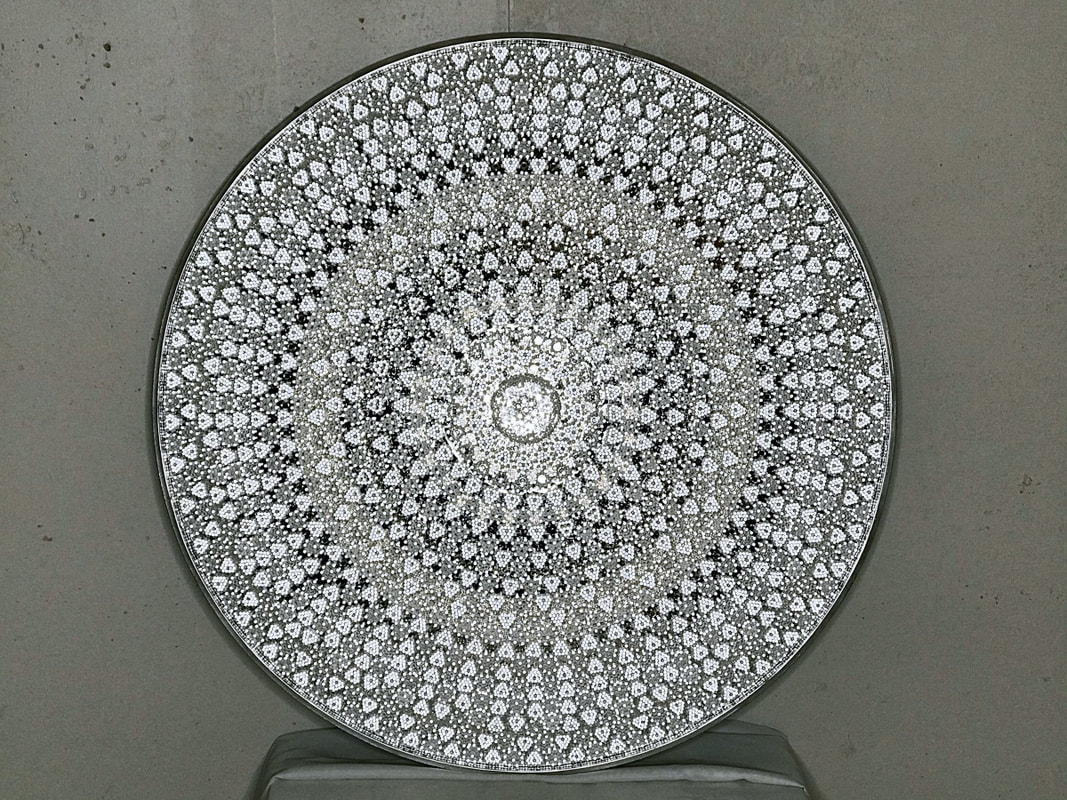 'Honeymoon Panopticon, the second piece in the Panopticon Series, was inspired by a lack of consent, betrayal of romantic intimacy, and a smart phone. That’s all I’m going to say about that. Unfortunately, the problem of lack of consent isn’t limited to intimate interpersonal relationships. It has become a concern worldwide. This results in an imbalance of power between the subjects of data collection and those who use it. The Panopticon Series explores both the benefits and drawbacks of humanity's new capabilities to observe each other, our world, and our universe. The piece is a woven bead tile mosaic on a 36" convex security mirror. Each tile is woven into the shape of a heart with reflective, pearly, and iridescent beads. This piece will be debuted at Sculpture at the Kavanagh opening March 26, 2021. You can view the exhibition in person or through a virtual exhibition. More info at the Fine Line Art Center's web site. 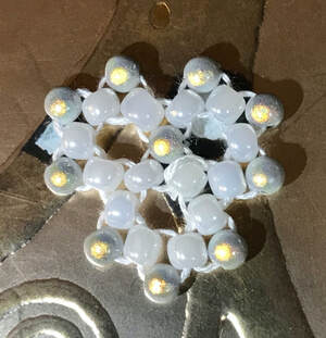 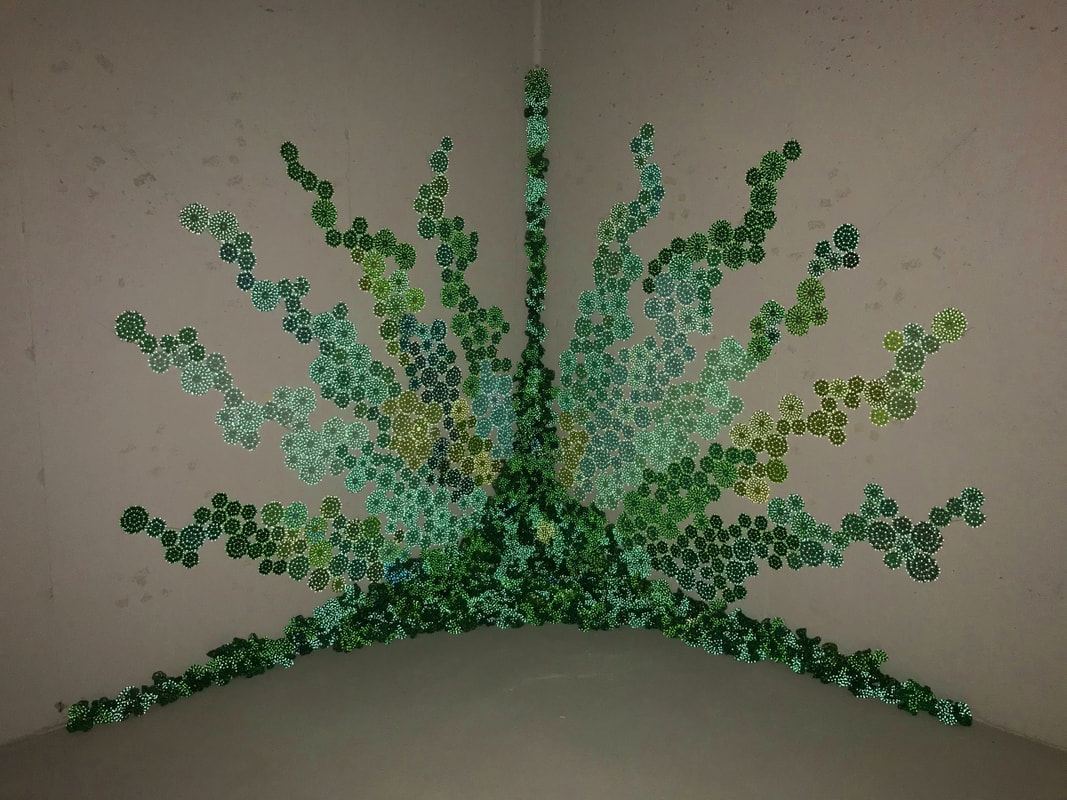 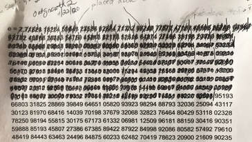 Above photo shows Outgrowth 2 in low light. It changes a lot with different lighting. It measures 6' x 6' x 6' centered on a floor corner of my poured-concrete basement. It is made entirely out of hyperbolically woven glass and reflective acrylic beads. And lots and lots of clear Gorilla tape. The piece can be dismantled and recreated elsewhere as a temporary installation or a permanent, outdoor piece with clear caulk. I'm very happy with this. I was very happy with Outgrowth 1, but number 2 turned out better than expected. The big difference between the two was the mosaic wall placement. For Outgrowth 1, I used the irrational number "e" (2.7182818284590452353602874713...). It is a number that shows up in population growth so I used it to place the mossy areas along the crack between to the three surfaces and onto the planes. It gave it a more natural growth pattern and, even better, I didn't have to fuss over where to place everything. I *did* fuss over where to place the wall tiles in Outgrowth I and it shows. For Outgrowth 2, I decided to divide the two vertical walls into 10 equal sections with 5 straight lines emanating from the origin point in the corner. I attributed each of those lines a digit from 1 to 0. (I can't remember why I decided to put 0 at the end instead of the beginning.) ((If anyone has a reason it should be the other way around, please let me know!)) Then I placed a wall tile using the line as the axis of growth for that number. I had blocked out two piles of colored tiles prior to installing. I wanted to keep same-color groups together so it would look like there were transitions to different colonies of lichen growing up the wall. Fun fact: the S curve in the final design did not appear in the original concept sketch. The S-curve fluctuates back and forth but remains centered on the growth axis. 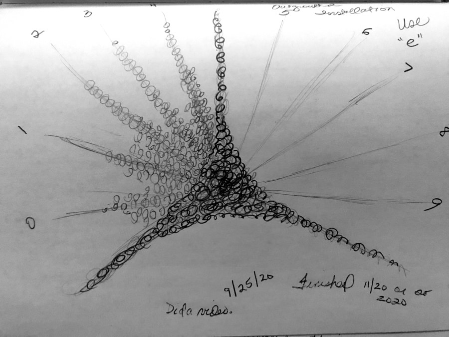 It's hard to photograph this body of work because the light effects are luminosity- and angle-dependent. A still photo captures a tiny sliver of the experience. I'll be making more videos featuring each piece to give people a better idea of their visual dynamics and dimension. The first video I did for this piece is fairly one-dimensional because it is a time lapse of the installation. I thought it would be fun to have little videos showing these pieces growing. The first one I made for Outgrowth 1 was terrible but got the point across. I'm learning. The video for Outgrowth 2 is a little better. (These are made with social media in mind.) Here's a short video in which I am wearing the light source. For the next video I'll try a fixed light source behind the camera. 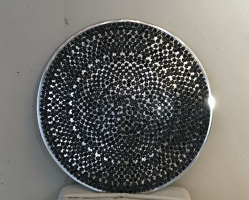 I finished Black Star Panopticon a few days ago. It is bead mosaic on a 26" x 26" security mirror. These are the security mirrors that show if a truck or person is coming around the corner of the loading dock or if a kid is putting a bag of Funyuns down their pants at 7-11. I installed strap hangers on the back because it will look great hanging flush on a wall. I still have the installation hardware it came with if someone has a loft and wants to install it in a corner.
Continuing with the formal aspects...since making Blue Star vase, I've been searching for another object with a mirrored surface because I still want to explore optical layering effects between the mirror, different qualities of glass beads and the reflective acrylic beads. I had considered doing a mosaic on a typical household decorative mirror, but wasn't excited about the idea because they are flat. Back in the day, doing art consulting and interiors I designed/ordered and installed a lot of decorative mirrors along with more typical art works. I was happy to find this mirror so I could add a dark industrial twist to domestic mirrors and enjoy working on a convex shape instead of settling on a flat mirror. The tiles of the bead mosaic are little ~3/4" woven hexagons of only 12 beads. I got a nice net pattern out of them. It's obviously a hand-placed mosaic and not a precision CAD print, but the hexagons still give the piece an engineered fell about it. Putting a security mirror in a strategic area of a home adds to the panoply of surveillance devices we have elected to live with. Someday, maybe I will find one of those interactive internet hubs people talk to in their homes and take a picture with BSP above it. I want to make another one. Drops of Jupiter was started in March and finished at the end of July 2020. I didn't have a plan for this when I started. C-19 quarantine had just started and I had finished Juicy Sunrise and had a lot of purple and pink beads and a weird purple vase on hand. At some point in the weaving I heard a sweet cover of "Drops of Jupiter" by Taylor Swift and designed off that. I don't have any art world influences for this one at all just the song and the stratified layers of Jupiter's atmosphere. Some scientists suggest (citation needed) that the composition and conditions in the atmospheres of Jupiter and Saturn may cause diamond precipitation. So that pink reflective-bead cloud suspended within the globe of the vase has a little crystal-drop chandelier. Design note: This piece was made out of a purple vase, but unlike the other vases I've done this one isn't a vase anymore. You can't put flowers or whatever in it because I nestled a bead cloud in the hole to suspend the chandelier cloud from. I'm calling it an assemblage sculpture with woven elements. (I feel guilty that I didn't provide a reference for where the diamond rain on Jupiter thing came from in the explanation above, so I found some videos that can give you an overview.) 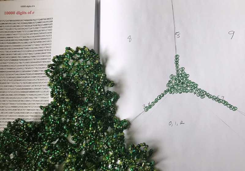 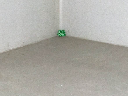 The first of many, many little moss units sitting in the corner like lint in a belly button waiting for me to finish weaving its friends. The first of many, many little moss units sitting in the corner like lint in a belly button waiting for me to finish weaving its friends. I have been very busy in lockdown. I studied some new weaving techniques that are faster and use less beads but still grow into biomorphic hyperbolic forms. I did a little IG video on the studies a few weeks ago at @thereforeijam. It's developing into a body of work that will encompass outdoor and indoor installations inspired by the growth patterns of moss and lichen. I am motivated to develop the outdoor site-specific installation/mosaic/mural pieces because it will open up new options and artistic growth. This means I have to tweak my materials--especially my adhesives--to be weather proof. I'm testing whether the acrylic reflective beads will fade or melt on a little test rock out in the front yard. I'd love to retain the reflective beads but if they can't survive harsh summer conditions, then I need to stick with all glass. I'd love to use the reflective beads as it calls attention to something that's often overlooked and they look really cool at night. Also switching from natural fiber thread to synthetic. While the outdoor materials test is underway, I'm working on an installation in a bare corner of the basement. "Outgrowth #1" grows out of the corner where the floor and walls meet. I'm using the number e with extra digits weighted to the floor to help me get a natural distribution. The areas higher up the wall that don't have moss pieces will have beaded representations of lichen colonizing the wall. I don't know if I will use a formula to arrange the lichen shapes. When I say "moss" and "lichen" these are obviously scaled-up impressions of those life forms. This body of work will be easy and cheap to transport and install. Clear silicon is a quick, semi-permanent adhesive for the exterior and some interior installs. It peeled off cleanly from my test rock after curing without a lot of effort. Gorilla tape/tabs for interior installs work great. The components are reusable. Many artists I admire have done corner installations. Dan Flavin, Lynda Benglis, and Olafur Eliasson use them a lot. Out of the images below I identify most with the implied dimensions in Smithson's piece and the organic quality of Benglis'. I adore Dan Flavin's work although my work has emotional content whereas I understand that he insisted his work did not. Lynda Benglis' use of acrylic foam instead of molten metal surprised me especially as the piece was addressing Carl Andre's work. That choice of material serves to further distinguish the one artist's vision from the other's. In a month or so, I should be ready to do the installation and take photos. Very excited. 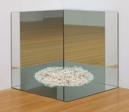 "Corner Mirror with Coral" Robert Smithson, 1969. 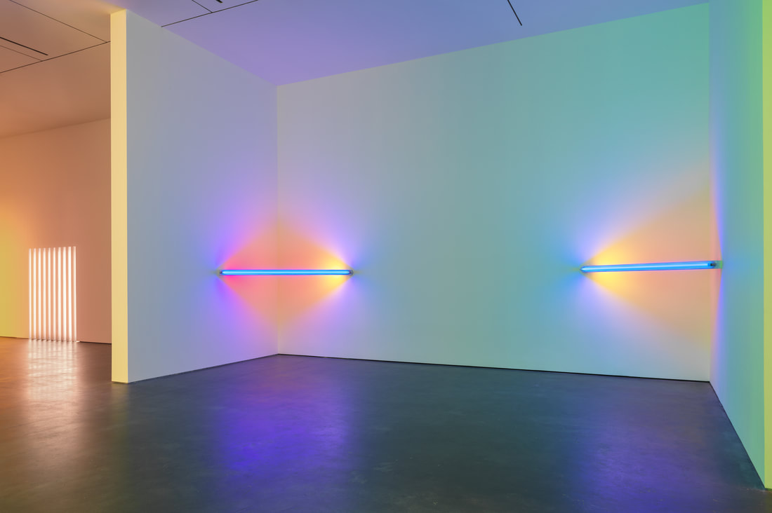 Dan Flavin at Zwirner Gallery 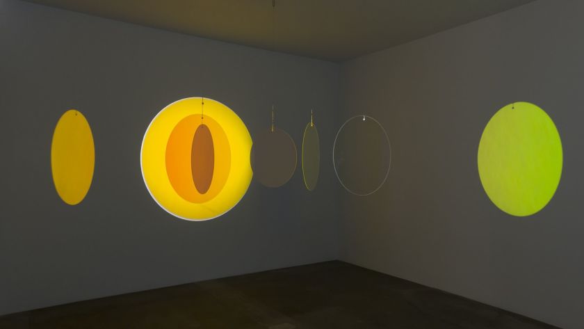 "Retinal flare space", 2018, Olafur Eliasson 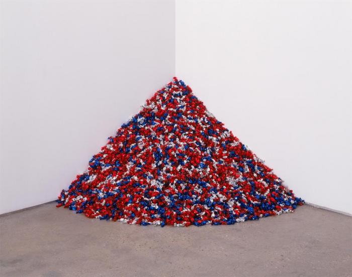 "Portrait of Ross in L.A." 1991, Felix Gonzalez-Torres 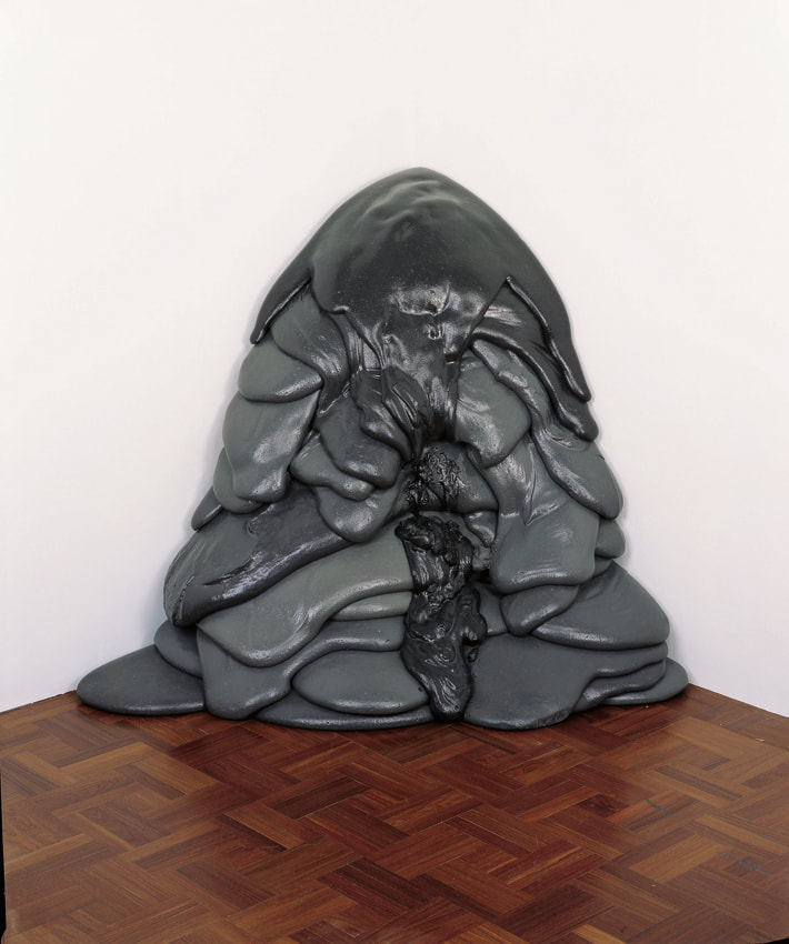 "Corner for Carl Andre" 1970, Lynda Benglis, Acrylic Foam (!not molten metal!)  "Corner Piece" 1969, Lynda Benglis 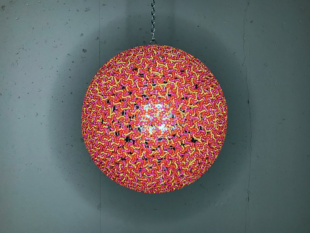 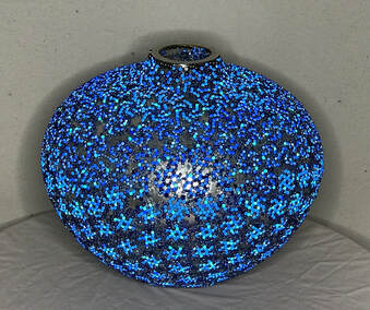 Blue Sun, 2019 Blue Sun, 2019 Above: Juicy Sunrise, 2020.
This piece is not about the coronavirus. This post is a half-hearted apology/ stammering explanation for having bad timing. I got tired last fall of working on glass vases. I wanted to use the same technique I use for them, but on a larger scale with more luminosity. After submitting a Saturn-themed proposal for a mini golf hole in October, I hit on the idea of making the Saturn of the golf hole a disco ball and embellishing it. I got very excited and found someone selling their 20-inch, vintage, slightly damaged disco ball and bought it. I had a mercury crackle glass vase on hand that I started making woven bead tiles for. This became Blue Sun. I loved the effects I was getting by layering glass and reflective bead woven tiles over mirror. It became Blue Star vase. That piece was a study for a luminous sun that I wanted to make. Meanwhile, there was going to be a long wait on the golf proposal and I really wanted to embellish a disco ball. It was calling to me from it's enormous box. I had finished Solar Panels a month or two prior, and I wanted another piece that celebrated clean energy sources. It's taking a long time to develop efficient fusion power reactors, and I am impatient. I decided to fulfill a wish by bringing the power of the Sun to Earth. The piece would be optimistic, joyous, and celebratory. I decided to make it a sunrise. Which is good because a high-noon yellow sun doesn't offer much for tonal variations so I opted for a color palette like a sun close to the horizon that is glowing like a red/pink piece of citrus fruit. I was designing this piece and sourcing & mixing bead colors in November and December. Sometime in December I started weaving the first tiles for Juicy Sunrise. Concerning reports started coming in on Twitter and news sources about a new killer flu-like disease emerging in China. Weave, weave, weave, weave, weave. The days went on. The reports out of the orient got more concerning. Then it spread to other countries. Around the time I finished Juicy Sunrise the first renderings of the novel conronavirus were being circulated like a WANTED poster and it looked a lot like my sculpture. I am quick to defensively point out, though, that my sculpture does not have the characteristic coronavirus nobbies. So you must acquit. Anyway, I'm using it as the featured image on my landing page. I'd say I will try to do better but this is a coincidence and tone deaf I stan for the utopian dream of nuclear fusion power. 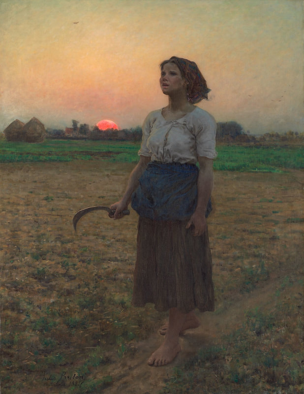 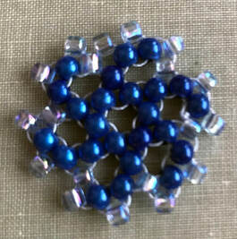 I am researching sun colors for my disco ball sun. I am leaning toward a reddish pink ball like the artist Jules Breton was so good at painting. I'm thinking somewhere between pink grapefruit and blood orange. I haven't started testing color variations yet, but I have a pattern that evolved while working on Blue Sun. It has a good scale to get the texture I want and a little repeating spiral to make it dyanamic. Imagine the beaded tile to the left repeating all over a sphere. I have to look at more astronomical pictures of the sun to see how or whether I should flip the spirals going left and then right. If you have ever been to the Art Institute of Chicago you have probably seen the picture above, "The Song of the Lark" from 1884. Although not a Regionalist piece, it resonated in sympathy with the midwestern aesthetic groundswell that brought "American Gothic" to fame. Rising or setting, I like his suns. These photos don't do them justice. The top one below is called "The Weeders" or "The Gleaners". The title I am finding for the bottom one is "Tired Gleaner." I'm guessing Breton's real titles were in French. 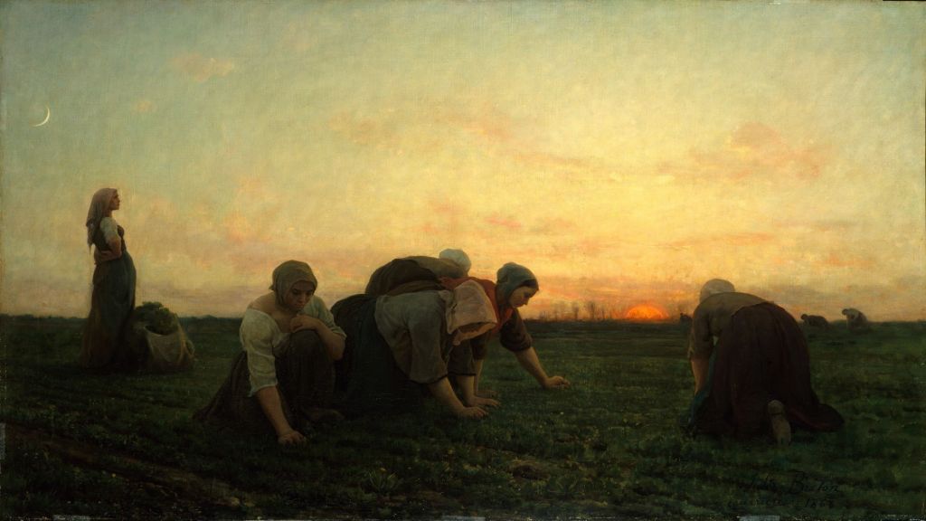 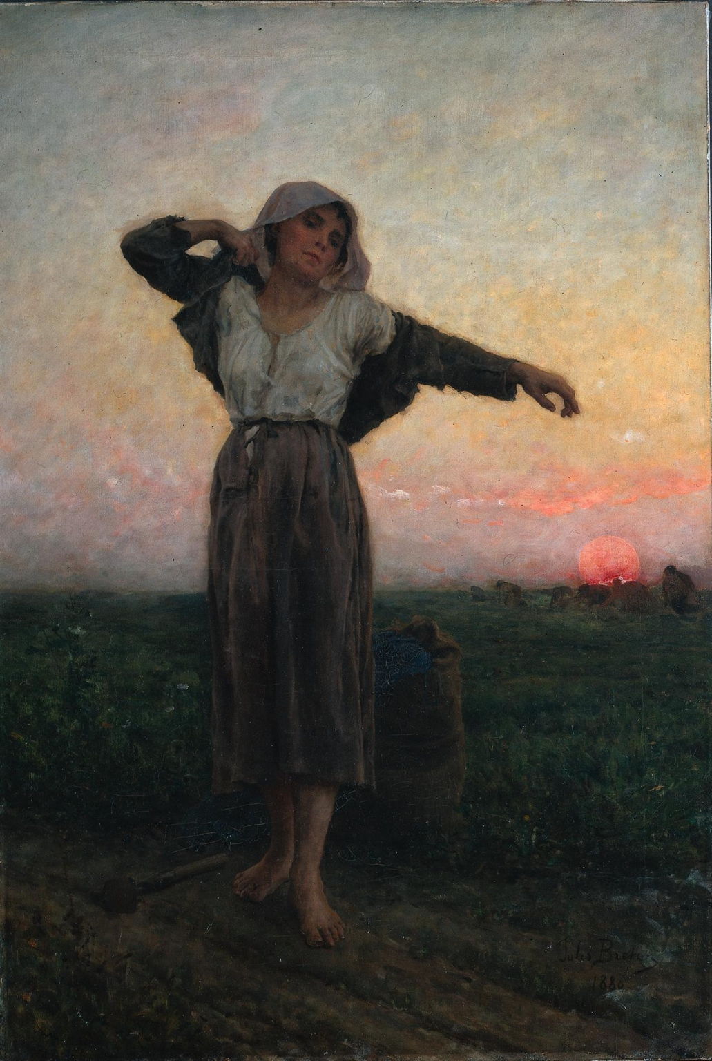  I'm starting work on a mercury glass almost-globe vase. It's a study for a disco ball sun or-- if my proposal is accepted for Par Excellence--Saturn. Or both. I want the reflective silvery surface to shine through the bead mosaic. I am learning some new bead tiling techniques inspired by of Gwen Fisher's blog. The modular tiles have nice voids that will hopefully give me a layered, dappled effect. It's going to be a blue star because I don't think I need those colors for other projects. I can spare them. I will be using blue reflective beads and blue transparent, maybe some translucent 6/0 beads. Back to Gwen Fisher...she is one of the hyperbolic and mathematical beaders. I love her work. 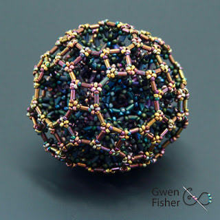 |
artist
Julie Mars' current events, projects, & inspirations. Archives
November 2023
Categories
All
|
 RSS Feed